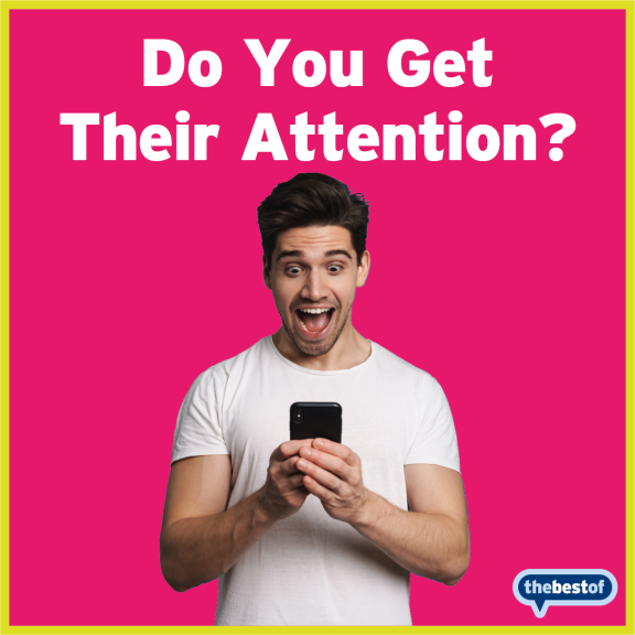
When used properly, ads in printed or online format are a hugely powerful tool to help grow your business. Now we’re not going to bombard you with all the details of what should be or shouldn’t be in an advert.
But what we are going to talk about is one area that is usually has the least amount of time and thought put into it - but is arguably the most important part.
The image.
It has ONE JOB:
To grab people's attention. That’s it!
Your copy is there to 'sell' what you're selling - the image is there to stop people from skimming or scrolling past it, and READ the words you've written.
If people don’t stop, they won’t read the copy.
So, what makes a great and effective Ad image?
Basically - Don’t Make Your Ads Look Like Ads! 🧐
Colourful
If you’re advertising or posting on Facebook, remember it’s a sea of blue, white and grey - so make your ad stand out by using bright colours. In general, yellow, red, pink and green work well both online and printed. Try adding a colourful border or background too!
No Text
REMEMBER: the job of the image is NOT to SELL - it's to stop people and get their attention. So if you're trying to add too many words selling things to your images you're going down the wrong route.
NOT Boring
This is the most important thing to consider when creating your images. Make sure they stand out, grab attention, and are completely 'un-miss-able'.
And if you want some help or ideas with your next Ad - Just email us at epsom@thebestof.co.uk and one of my team will gladly talk you through it!
Helping local businesses get seen with trusted recommendations, directory listings and community-led promotion. We offer everything from a simple directory listing to full-service marketing solutions...
The following Cookies are used on this site. Users who allow all the Cookies will enjoy the best experience and all functionality on the site will be available to you.
You can choose to disable any of the Cookies by un-ticking the box below but if you do so your experience with the Site is likely to be diminished.
In order to interact with this site.
To show content from Google Maps.
To show content from YouTube.
To show content from Vimeo.
To share content across multiple platforms.
To view and book events.
To show user avatars and twitter feeds.
To show content from TourMkr.
To interact with Facebook.
To show content from WalkInto.